B+B

Web Design

A movie preview and booking platform  

A simple way to browse and book movie tickets. Just the clean, clutter free way to go!

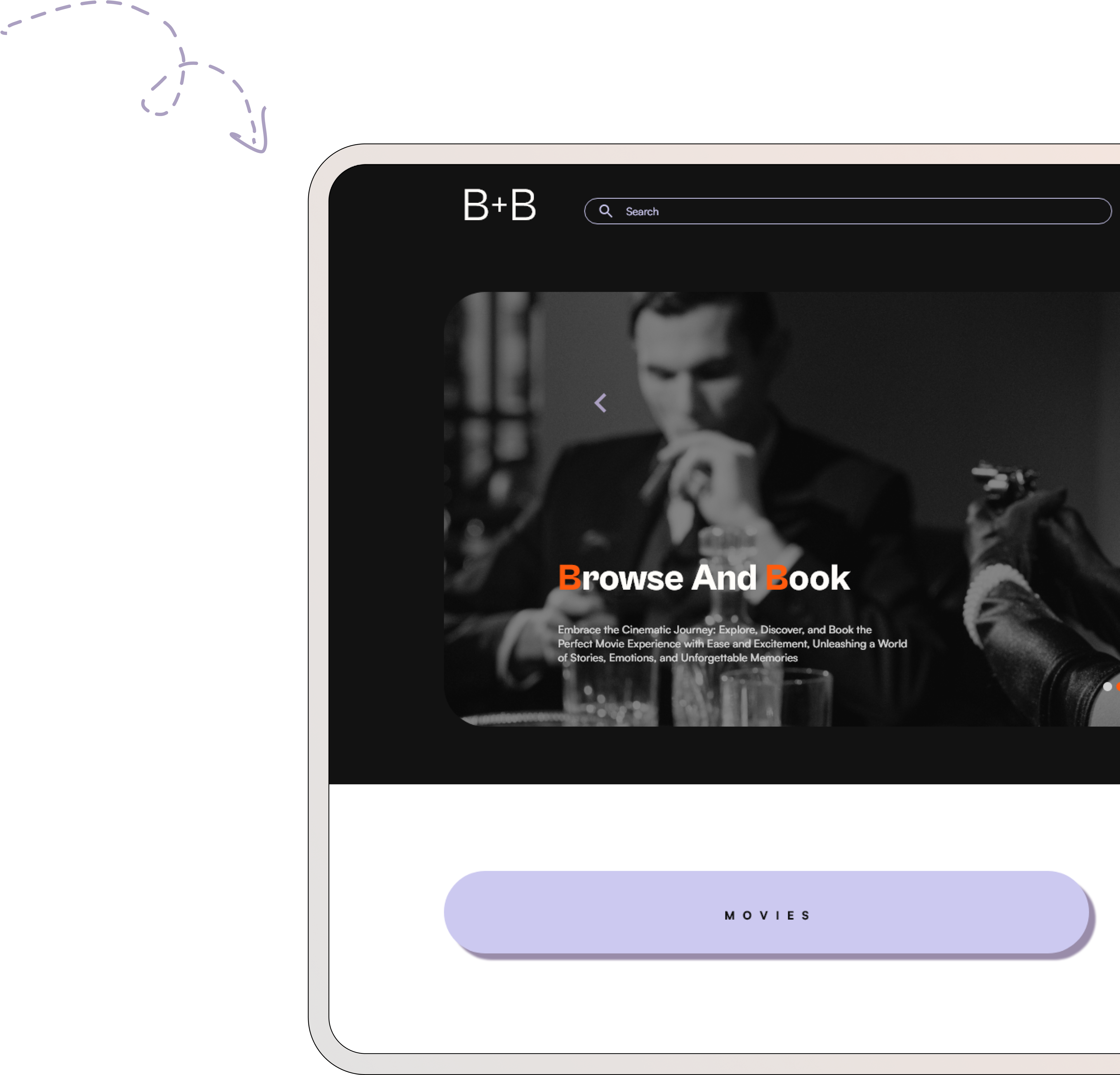
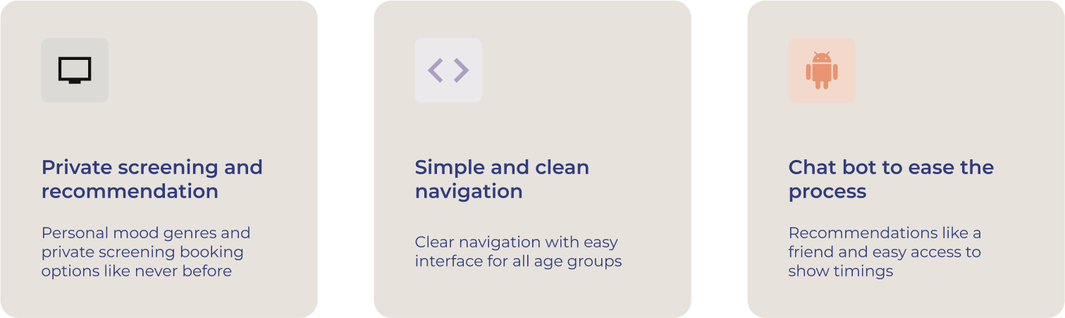
This UX case study focuses on a user-friendly movie booking responsive website. With its intuitive interface, users can explore previews, book tickets for upcoming releases and schedule private screenings.

The website also provides exclusive behind-the-scenes content and engaging interviews, offering a seamless movie browsing and booking experience for film enthusiasts.

01 Problem definition

Problems we all face every time to book a movie!

Complicated interface

Seriously! These interfaces are so busy I sometimes forget what I was looking for. Don't you think so?

Personal recommendation

Let's be honest. With so many movies, who doesn't want personal recommendations like you get from a friend

Private screening

Private screening has always been a task, its super hard to have a smooth booking. Sometimes we don't even know where to look

02 User research

Usability tests

Let's see what people feel about using other movie preview and booking apps

User surveys

I conducted online surveys with a curated list of questions about movie previewing and booking experience. This helped me discover many more problems, needs and experiences users face

Competitive Analysis

Understanding the business need and user need by analysing what are they doing right and wrong

03 Solution

Features introduced into the existing structure

After multiple surveys and discussions with people around, I identified these features could enhance the movie enthusiasts experience of previewing and booking movie tickets

04 UX phase

User flow

This is something I started as a scribble on my sketch pad, which made me realise the path user need to / might / should take. Drawing out the path organically will lead to an informed information architecture

Wireframes

This is something I started as a scribble on my sketch pad, which made me realise the path user needs /might /should take. Drawing out the path organically will lead to a informed information architecture

05 Colors and Typography

Styleguide

B+B uses a color theme inspired by energy and instructiveness. Mandarin Orange and lavender bring in vibrancy and soothing subtle ambiance to enhance the user experience. Base colors are neutral shades which add to the balance and clean backgrounds

06 UI Phase

User interface

Movies

Browse movies based on your mood

Through user surveys most of the users claim their movie preferences vary with mood and time, I have added a filter with mood for easy decision making and avoid browsing through long lists of movies

Booking

Seat selection, food selection and... accessibility selection

I have introduced intense dark background with seat selections popping out easily, it also gives a sense of cinematic expression. Theaters showing available accessibility features is going to help users make an informed decision

Private screening

Entertainment you can host

Private screening option has always been hard to approach for entertainment lovers. Primary problem was connecting with the multiplex and understanding the booking process. I added a specific section for private screening with an easy process of understanding booking and also an opportunity to contact the multiplex. Chat bot also will add to the assistance of the user

Responsive

On all devives

As a part of my Google UX design certification, I researched and designed B+B booking application for three different screen sizes. Desktop | Tablet | Phone